- December 15, 2014
See the interactive graphic here.
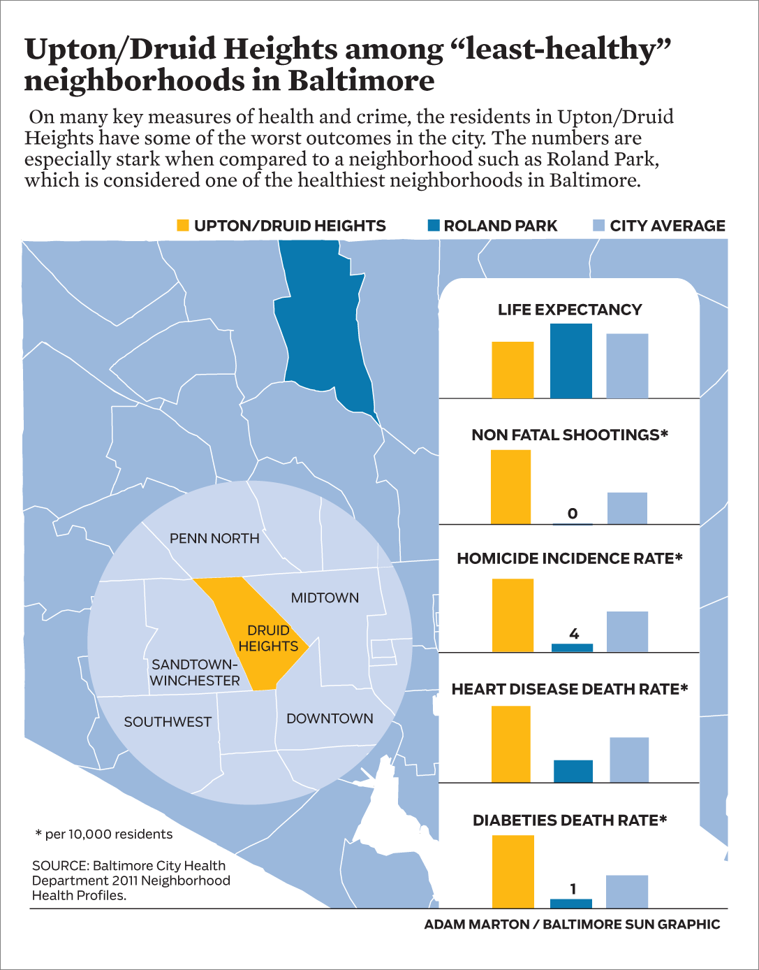
A Baltimore City Health Department report ranks city neighborhoods for many social determinants and health outcomes. Life expectancy, homicide and heart disease rate are wildly different depending on the neighborhood where you live. Much of the neighborhood disparity breaks down along economic and racial lines, compounding the already complex issue.
I designed this package of print and interactive graphics to accompany an excellent investigation into the effects of violence on children the Baltimore Sun by Andrea K. McDaniels.